
Mobile-First Construction Website Design in 2026: Why 70% of Your Leads Search on Their Phone
Mobile devices now account for 68.1% of all global web traffic. Over 70% of homeowners search for construction companies on their phone. If your construction website is not built mobile-first in 2026, you are losing the majority of your leads before they even read your services page.
 Bilal
9 min read
Bilal
9 min read
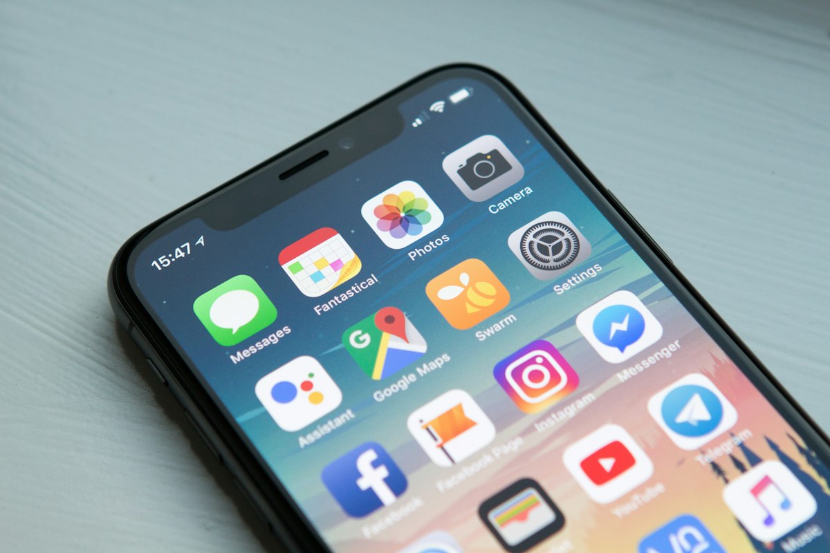
More than 70% of homeowners searching for a builder or construction company in 2026 do it on their phone. Not at their desk. On their phone, often while standing in a room they want to renovate or sitting in their car outside a property they just viewed.
Statcounter Global Stats for Q1 2026 confirmed that mobile devices now account for 68.1% of all global web traffic, up from 64% in 2025. For local service businesses, including construction companies, that figure is even higher. Research from Web Design Mechanic found that over 70% of homeowners specifically search for contractors and construction services on mobile devices.
Yet the majority of construction company websites in the UK, US, and Canada were designed for desktop first. The mobile version was an afterthought. A shrunken version of the desktop site that loads slowly, displays awkwardly, and frustrates the exact potential client your business most needs to impress in those first three seconds.
This article explains what mobile-first construction website design means in 2026, why Google penalises sites not built this way, and what your mobile site needs to convert phone visitors into project enquiries.
What Mobile-First Actually Means for Construction Website Design
Mobile-first is not the same as responsive design and the distinction matters significantly for your rankings and lead conversion. Responsive design means a website adapts to different screen sizes. A desktop site that reorganises itself to fit on a phone. This was the standard for years. In 2026 it is no longer sufficient because it starts from the wrong place.
Mobile-first design means the phone experience is designed and built first. Content priority, navigation structure, button placement, form layout, and loading performance are all solved for the smallest screen first. The desktop version then builds on that foundation. The result should not feel like a desktop website squeezed onto a phone. It should feel intentional, fast, and effortless on the device most of your potential clients are actually using.
Why Google Now Indexes and Ranks Your Mobile Version First
Google completed its transition to mobile-first indexing in 2024. In 2026 the implications are fully embedded in how rankings work for construction companies. When Google crawls your website, it crawls the mobile version. It reads the mobile content. It evaluates the mobile performance. Your rankings in Google search results are determined almost entirely by how your mobile site performs, not how your desktop site looks.
This creates a critical problem for construction companies whose mobile and desktop versions differ in content. If your full services list appears on your desktop homepage but is hidden on mobile, Google treats those hidden services as non-existent. If your project gallery displays 20 photos on desktop but only 4 on mobile, Google indexes a site with 4 photos. Content parity between mobile and desktop is not optional in 2026.
The 3-Second Rule and What It Costs Construction Companies
Research consistently cited by Google shows that nearly half of mobile visitors abandon a website that takes longer than three seconds to load. A construction website loading in five seconds on mobile loses approximately 40 to 50% of visitors before they see anything. They never read your services. Never see your project gallery. Hit the back button and call the next company on the search results list.
Most construction company websites we audit load in five to eight seconds on mobile. The cause is almost always the same as the Core Web Vitals problems covered in our article on website maintenance for builders. Large unoptimised project photos, too many active plugins, and budget shared hosting. A mobile-first construction website design addresses all three at the architecture level rather than trying to fix them after the fact.
What a Mobile-First Construction Website Must Include in 2026
A Click-to-Call Button Visible Without Scrolling
A potential client on their phone has one goal. Finding a number to call or a way to get in touch quickly. Your phone number needs to be visible in the first screen view without scrolling and must be a clickable link that opens the phone dialler immediately when tapped. A phone number displayed as plain text requires the visitor to copy and manually type the number. On mobile that friction is enough to lose a percentage of leads to competitors who have click-to-call working properly.
A WhatsApp Enquiry Button on Every Page
A growing proportion of UK, US, and Canadian homeowners prefer sending a WhatsApp message to making a phone call for an initial construction enquiry. A sticky WhatsApp button fixed to the bottom of every mobile page removes the friction of form filling and produces direct enquiries in the channel many clients prefer. For more on this, see our guide on how to get more project enquiries from your construction website.
A Contact Form With Three Fields Maximum
Mobile form completion rates drop sharply with every additional field. Three fields is the standard for a high-converting mobile construction website contact form. Name, phone number, and a brief project description. Everything else is gathered in the first conversation. Every additional field beyond three is a reason to abandon the form.
Thumb-Friendly Navigation
Most mobile phones are used one-handed with the thumb navigating the screen. Navigation elements placed at the top of the screen requiring stretching to reach produce worse engagement than navigation placed within natural thumb reach in the lower portion of the screen. Mobile-first navigation is large, clearly labelled, and designed for a thumb rather than a cursor.
A Project Gallery Optimised for Mobile Browsing
A project gallery is the most important conversion element on a construction website and also the element most commonly damaged by poor mobile implementation. A mobile-first project gallery uses single or two-column image grids, compressed and properly sized images that load quickly, simple tap-to-expand functionality, and caption text at a readable size without zooming. Visitors should browse 20 project photos smoothly on a mobile connection without waiting or struggling with the layout.
Mobile-First and Your Google Local Pack Rankings
The connection between your mobile construction website and your Google Maps local pack rankings is direct. Google evaluates your mobile site quality when determining local pack positions. A construction company with a fast, well-structured mobile site ranks better in the local pack than a competitor with equivalent Google Business Profile optimisation but a slow or poorly structured mobile site.
The local pack ranking signals that relate to your website including click-through rate from search results, time spent on site after clicking, and bounce rate back to search results are all measured from mobile visits because the majority of local pack searches happen on mobile devices. For the full picture of local SEO for construction companies, read our guide on what local SEO is and how it works for construction companies and our article on 5 reasons your construction company is not appearing on Google Maps.
How to Test Your Construction Website Mobile Performance Right Now
Open your website on your phone using mobile data rather than Wi-Fi. That is the connection the majority of your potential clients use when searching for a builder. Navigate to your services page and contact page. Count how many seconds it takes for the page to be usable. If it takes more than three seconds, you have a speed problem losing you leads right now.
Try to find your phone number and call it in three taps or fewer. If it requires copying and pasting the number manually, your click-to-call implementation needs fixing. Fill in your contact form using only your thumbs. If you have to zoom in at any point, or if any field is difficult to tap accurately, you are losing form completions to friction every day.
Run your homepage URL through Google PageSpeed Insights on the mobile setting at pagespeed.web.dev. A score below 70 on mobile indicates performance that is actively suppressing your search rankings. For more on this, see our detailed breakdown of how to get your construction company on page one of Google.
What Bilal Web Studio Builds for Mobile-First Construction Companies
Every construction website design we build in 2026 is built mobile-first. The phone experience is designed first and tested thoroughly before the desktop version is developed. Click-to-call in the first screen view, a WhatsApp enquiry button on every page, a three-field contact form, thumb-friendly navigation, a properly optimised project gallery, and mobile load times under two seconds are built into every project as standard.
We do not design a desktop site and shrink it. We design a mobile experience that wins enquiries from the 70% of potential clients searching on their phones, then build the desktop version to match. For the full picture of what our construction website design service includes, read our article on why every construction company needs a professional website in 2026 and our guide on how to choose the right web designer for your construction business.
Frequently Asked Questions
What percentage of people search for construction companies on mobile?
Over 70% of homeowners search for construction companies, contractors, and builders on mobile devices. Globally, mobile devices account for 68.1% of all web traffic as of Q1 2026. For local service businesses including construction companies, mobile traffic typically represents 70 to 85% of all search traffic.
What is the difference between mobile-first design and responsive design?
Responsive design adapts an existing desktop website to fit smaller screens. Mobile-first design builds the phone experience first and enhances it for desktop. Mobile-first produces better performance, better usability, and better Google rankings because the constraints of the mobile experience are solved at the design stage rather than retrofitted afterwards.
Does Google rank construction websites based on their mobile performance?
Yes. Google uses mobile-first indexing meaning it crawls, indexes, and ranks websites based on their mobile version. Your desktop site has almost no direct impact on your Google rankings in 2026. Only your mobile performance, mobile content, and mobile user experience determine where you rank in search results.
How fast should a construction website load on mobile?
Under three seconds is the threshold below which most visitors will wait. Under two seconds is the standard for well-optimised construction websites. Run your homepage through Google PageSpeed Insights at pagespeed.web.dev. A score below 70 on mobile indicates performance actively suppressing your search rankings.
Does Bilal Web Studio build mobile-first construction websites?
Yes. Every construction website we build is designed mobile-first with click-to-call, WhatsApp enquiry buttons, optimised project galleries, thumb-friendly navigation, and mobile load times under two seconds built in as standard. Starting from 2,500 GBP. Book a free strategy call at bilalwebstudio.co.uk.